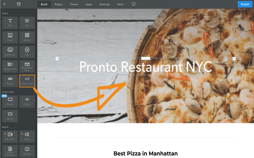
The online ordering button is a custom HTML code that you add to your website. In Weebly, custom HTML code is added with the Embed Code element. One constraint to have in mind: depending on the header type you use, you might be forced to place the button lower on the page.
How to add the online ordering button in Weebly
Video Instructions
Text Instructions
How to add the button to the (home)page: find a good place for positioning your online ordering button, preferably right after the fixed elements. Your goal is to show the button as high as possible so that your customers can easily see it.
- Drag an Embed Code element and drop it where you want your button to appear.
- Click on it to edit the custom HTML code.
- Paste the custom code of your ordering button.
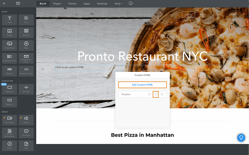
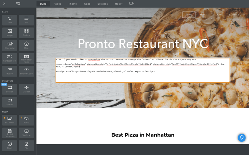
In the end, your homepage should look like this: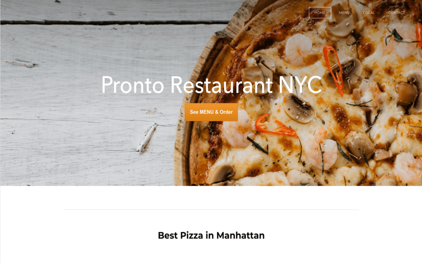
If your website has multiple pages, we recommend you to add the See MENU & Order button to other pages as well (like Contact page).
Header types and their limitations
The Weebly header types you use in your pages influence the positions allowed for the See MENU & Order button.
- Tall and short headers: probably the most used types for homepages and also our choice for the example above. The actual content of your page comes below the image. So the highest you can drag an embed code element is below the image. When using these header types, keep in mind that many people do not scroll. If you really want customers to see a certain piece of content, be sure to place it above the fold.
- No header: used more often for secondary pages. No pre-set image so no restriction. Your button can go right after the navigation menu.
- Landing page: This is similar to the tall header, but it offers you some more space for text and a button. Be aware that this Weebly button cannot be configured to open the online menu. So just like in the tall header, you will need to place the See MENU & Order button below the image. This will result in showing two buttons, one below the other, which we don’t encourage you to do at all. It will only decrease your conversion. Better switch to the tall header.
- Splash header: this is like no header, but with a background image. This means that you have the complete liberty to position your content.

