The right online menu design ideas will ensure that your restaurant stands out and that you provide a memorable experience for users. That’s crucial if you want your restaurant to be successful and ensure that patrons return for a repeat sale.
Traditionally, 70% of customers won’t return to your restaurant after the first visit. If you want to beat the curve, then you need your restaurant to make an impact.
Creating a positive image of your restaurant requires you to hit several targets at the same time. It all starts with your online menu. This is one of the first user interactions customers have with your business.
Consequently, you need to make the right first impression. Since your customers aren’t able to touch the menu physically, you need to employ other strategies to have your online menu pop out to them.
It all starts with designing a menu that looks great on any device, from mobile to tablet to desktop. Optimizing the menu will ensure that your customers have a good first experience.
If the first thing they notice is how your menu looks terrible on their phone, the subsequent experience might be less pleasant overall. With mobile marketing for restaurants at its peak, this is just something you can’t afford.
Below you’ll find more information about how to create the perfect menu for 2024.
How Do You Design a Menu Layout?
First, you need to consider how to design the layout of your menu and whether you’ll be using a template or create it from scratch.
A template gives you the building blocks to work with and a strong starting point. Templates can be free or purchased depending on your budget. You can also adapt a template and customize it to ensure it matches your restaurant perfectly.
MustHaveMenus gives you the largest collection of professional designs to choose from and customize. With over 7,000 menu templates, you can find a design for every type of restaurant, food, and aesthetic. Their editing tool was designed for restaurants and makes it easy to create new menus, customize their many templates, and update existing designs.
The design of your template needs to look good and get your brand’s message across. You can achieve this by using visual communication that goes above and beyond the basics.
Since you don’t have very much to draw customers in with before they’ve tried your food, having them like your online menu is a great way to captivate their attention right away.
Think about compatibility issues as well. You need to consider whether your menu can work with Google, delivery apps, or any other piece of software. It needs to look great on phones, tablets, and any device your customer might choose.
One of the main focuses needs to be user experience. This refers to every interaction a user has with your business online. Every time they read your menu, they are interacting with your company.
Is the menu appealing and easy to navigate? Is it pleasing to the eye, or does it seem dull and dreary? You should be testing your menu layout to ensure it pleases your target audience.
Think about how users interact with your menu as well.
Initially, designers assumed the center of the menu was a sweet spot. The latest research suggests customers read a menu left to right like a book on any device.
If you’re struggling to craft the perfect menu layout, hiring a freelance designer can be an option. Freelancers can offer their expertise and ensure that your menu is user-friendly online.
5 Tips for Designing Menus
There are some simple menu design ideas to keep in mind that will help you hook the audience and ensure they love your menu. These work regardless of what type of business you’re creating a menu for.
- Use great visuals. Choose your best-looking food and take some Instagram-worthy shots of the dishes for your menu. Tantalize your customer’s taste buds with dishes that they won’t be able to resist. Make sure that when you take the photos, the food is plated to perfection. Here it makes sense to hire a professional photographer to do this for you. Food photography is notoriously hard and you don’t want to use unappetizing images of your best dishes in your menu.
- Match your brand. Make sure your menu design matches the rest of your company’s aesthetic. From the color scheme to typography and the kind of visuals you use.
- Focus on value. Don’t fall into the trap of making your menu look too expensive or overly fancy. Most customers will be looking for great food at a great price. Center your menu on options that provide the highest value.
- Use pairing tricks. Make sure that you are pairing items on the menu. Use tricks of the trade, including a chef’s menu. Draw attention to delicious dishes that your customers won’t want to miss. Write a menu that sounds delicious.
- Tell them a story. Selling a story is the best way to captivate your audience. You can tell countless stories about your food. Discuss how it’s prepared or draw attention to health aspects with nutritional info.
Best Tools to Create a Menu
When you create your menu, you need to engage your customers. Ensure that your menu delivers fantastic levels of value – this will convert them to royal patrons. The secret to this is creating good memories and good experiences.
If you need to design beautiful content quickly, consider using stock images. These are cheap or free and look fantastic. The proper templates can also provide you a great starting point for a brilliant design.
There is also a range of tools you can use to create your menu. Here are some of the top options to explore.
1. GloriaFood
GloriaFood keeps things simple when designing your menu. You can add your pictures or choose from a range of stock images that we provide. It’s also easy to add mouthwatering promotions at the top of your menu.
The software for creating a menu is part of the more extensive service that GloriaFood offers. We aim to empower restaurant owners by offering a free online ordering service.
2. Vectornator
Vectornator, while a graphic design software, is still a great way to design a unique-looking menu. With unlimited artboards, custom fonts, auto-trace, and the ability to create stunning, custom illustrations for your menu, Vectornator truly delivers if you’re after an authentic look and feel.
Custom illustrations are a great way to showcase your restaurant’s personality and with Vectornator, you can do just that.
3. Flaticon
Flaticon is a large collection of free vector icons and illustrations. Vector graphics are great for menus because they scale perfectly and can be used in any size and color.
You can find a huge selection of flat icons in every shape, color, and size. The site also offers an online editor that lets you customize your own icons or search through their database for a specific icon you want to use on your site.
4. Visme
This software is focused on allowing companies to create professional, branded documents, including menus.
A key benefit of Visme is that you can create fully interactive content. This can be used to create a menu that provides a more compelling and exciting user experience. Think about building a menu with food photos that come to life.
5. Figma
Figma is often described as the Google Docs for designers. It’s similar to Sketch, but it works in your web browser. Figma allows you to connect with people in real-time. It’s great if you’re working remotely with a designer for your menu and want to stay on top of the collaboration and any changes.
6. Heyzine
Heyzine is what is called a flipbook maker, and flipbooks are great for creating online publications and digital menus in a new and attractive way. You can use Heyzine to convert your existing menu in PDF, DOC, PPTX, or a Canva project, into an online flipping book with a realistic page turn effect. You can even add videos, links, and forms for your customers to leave feedback. The main advantage is how easy and quick it is to publish your existing menu online and make it perfectly fit your brand.
3 Great Examples of Forward-Thinking Menu Design
Forward-thinking menu designs are always going to stand out and make a great impression. Here are some of the best examples worth exploring to discover new menu design ideas.
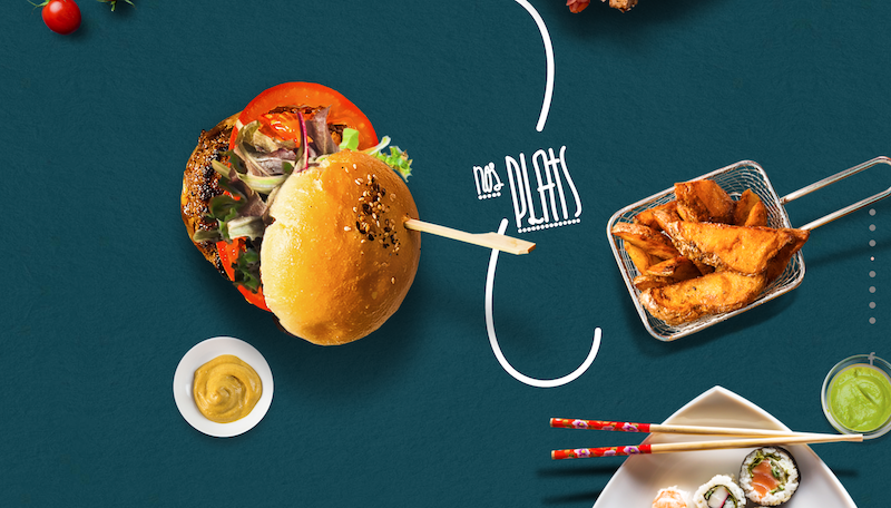
Le Mugs
Mugs have a menu like nothing you have seen before. It has incredible visuals and an interactive design. Instead of switching between pages, you can click on one food and scroll to see other choices.
It’s a highly user-friendly design that shows you can make a menu feel immersive. It’s fun, the food looks delicious, and the menu is easy to read. Perfection.
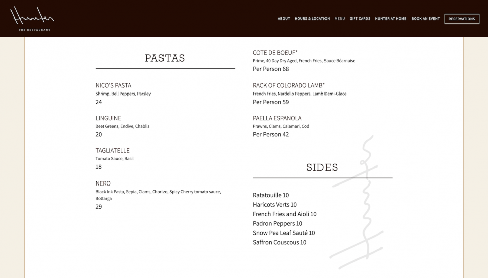
Hunter
Hunter proves that sometimes simple is the best solution. It provides an online menu with a minimal design and lots of space. This makes the menu easy to read and navigate. Cursive font and large headers ensure the menu looks attractive.
The black and white design also guarantees this menu feels classy and distinct. The simplicity and minimalism work well for this particular case. With no frills or food images, the menu items speak for themselves, allowing the reader’s imagination to get to work.
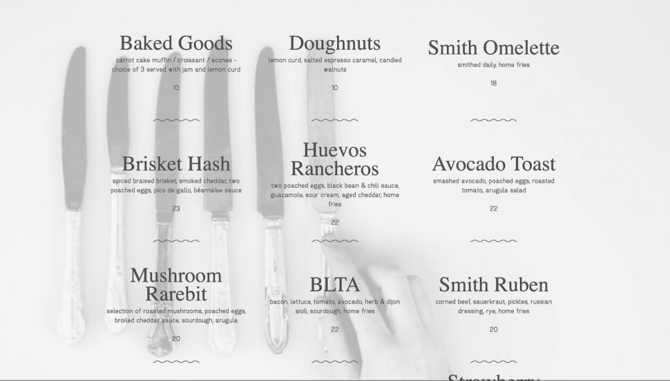
Smith
As you’re scrolling through this delicious-sounding menu, several actions unfold in the background.
A table is being set for a meal, milk is being poured into a coffee cup, cutlery making its way across the table. It’s visually interesting to follow as you scroll through. These little scenes unfolding in front of your eyes are strangely captivating. The descriptions of the dishes also sound amazing.
Menu Design Ideas for 2025
If you want to keep customers interested in your restaurant, keeping up with the trends is essential. Here are some of the choices you should consider for your online menu.
Mix analog and digital
Your restaurant menu needs to appeal to customers of all ages, from Gen Z to baby boomers. Many are eager to see your business go digital, and this includes your menu. Even if you have an analog menu, it should connect seamlessly to a digital experience.
When your patrons visit your physical location, there will still be a paper menu for them to check out, but providing a fantastic-looking online menu is equally important. The two menus don’t have to look identical, though.
Keep it simple
You need to ensure that your online menu is easy to use. Try to get every item on one page and ensure it is simple to scroll. Use a basic layout with a clear font that users can quickly scan through.
Simplicity also means using the right number of visuals, both photographs of the food or illustrations. Sure, the menu needs to look appealing, but overstuffing it with images for the sake of the images themselves won’t cut it.
Use the appropriate imagery in appropriate sections. If your customer can barely read the menu because of all the other stuff surrounding the actual description of the dishes, that can be a bit frustrating especially if they’re on a small device.
Use CTAs
Customers might explore your menu before they visit your restaurant. Use calls to action to encourage them to place an order or book a table. You can also add social media buttons. This should boost customer engagement and improve the customer loyalty at the same time.
‘Follow us’ and ‘review us’ are great essential CTAS worth using on your menu.
Stick to one theme
As mentioned earlier, the colors and the typography for your digital restaurant menu should match the theme and general vibe of your restaurant, as well as that of your social media. Your brand’s aesthetic needs to translate and match across all channels.
Using random fonts across your menu is a distraction, and avoiding doing so will result in a smooth and enjoyable experience for your customers.
How to Create Memorable Dining Experiences
If you want customers to continue coming back to your restaurant, you need to guarantee a memorable experience.
They need to have a great time so they mention your restaurant to friends and family. This will also be essential for repeat sales and positive reviews.
For your restaurant to be successful, this is one of the top issues to focus on. There are a few options to explore here.
A big part of this is using the right tech. For instance, you can think about exploring augmented reality. Augmented reality brings the restaurant experience to life in an exciting new form.
It completely blurs the line between the real experience and the digital one. One way to use AR is to show users a 3D model of what their meal will look like before they order. This could include the size of the meal.
Many customers are disappointed to discover a dish is not as large as they hoped.
QR codes can also make it easier for customers to get the information they need and manage data. For instance, if you want to offer them a contactless experience, your patrons can access your menu by scanning a QR code.
Check out this video to see how easy you can create a free QR code menu with GloriaFood:
The key point is to ensure that you are blending the old and new. Give users a personalized experience with a wider potential at their fingertips through a tech device.
When you are creating an online menu, think about how to improve it visually. Use typography that is easy to read, matches your restaurant and feels fresh. Make sure you explore visuals that stand out and leave a lasting impact.
Remember, you need them to keep coming back for more.
Revitalizing Your Online Menu Design
We hope this helped you understand some of the best ways to take your online menu design to the next level in 2024.
If you take the right steps, you will increase customer retention and provide a better experience.
The right menu design ideas will be essential for ensuring that restaurants provide the experience customers want and demand.
Author’s note: This article is a guest post.
