
When you enter a restaurant, you form an opinion about it and the food in a couple of seconds by just scanning the interior and menu. You may not realize, but, subconsciously, color can severely impact your experience at a food business.
By learning more about restaurant color psychology, you can update your business to attract more customers and get them to order more of your delicious food.
In this article, you will find which colors stimulate the appetite and which should be avoided in a food establishment:
What Colors Make You Want to Eat?
When you run a business in such a competitive industry, every detail matters. For example, if the colors of your walls could make your customers feel more comfortable and order more, the effort of painting them is well worth it.
Check out this list of colors that increase appetite and start taking advantage of restaurant color psychology:
Red
The color red immediately attracts attention. Let’s say you have before you a plate on a red placemat and one on a black placemat, which one would you look at first?
- Red is known to give an energy boost, heighten impulses, and increase heart rate;
- In nature, it is usually the color of attractive fruit full of sugar and thus, it subconsciously increases appetite;
- You usually see fast food places use this color, but you should also find ways to incorporate it even if you have a different type of restaurant.
Read more: How to Start a Fast-Food Restaurant That Customers Will Love
Orange
Similar to red as in it increases appetite and is an energizing color, but it doesn’t involve the same element of urgency.
- It makes people feel more comfortable but should be used sparingly because too much yellow can be overwhelming;
- It is also associated with good value and persuades people to spend more time at your establishment;
- Orange is usually associated with orange juice and makes people think of healthy food.
Yellow
According to restaurant color psychology, yellow makes people feel happy and energetic.
- The brain secretes serotonin when it encounters yellow, leading people to feel enthusiastic about their future meal;
- More toned-down shades of yellow are associated with food, but very saturated shades of yellow can create a sense of uneasiness, leading to a faster turnaround.
Read more: How to Increase Your Restaurant Table Turnover Rate & Serve More People Faster
Green
While not as powerful as the previous colors, green is still a mild-appetite stimulant. We associate it with green leafy plants that are edible but not as delicious as red fruits filled with sugar.
- It has become synonymous with healthy, fresh, vegetarian, or vegan food;
- Turquoise, the combination of green and blue is also a mild-appetite stimulant, but it also has a calming quality from the blue component.
What Colors You Should Avoid at Your Restaurant?
Rules are often made to be broken but it is best to choose after you acquire the knowledge about restaurant color psychology. Some colors don’t exist in nature in the form of food, so people don’t associate them with food establishments.
Here are the colors you should stay away from at your restaurant (unless you use them in small amounts):
Black
Black implies elegance and sophistication, but it won’t make your food more appealing. Instead, choose to use black for the following elements:
- Text on the menu: as it creates the biggest contrast with white, your menu will be extremely easy to read;
- Logo: with a single contrasting color for simplicity or just a simple touch to elevate other elements;
- Decorations: unless you have a dinner-in-the-dark concept, avoid using black for walls because it can make a space feel small and claustrophobic. Instead, you can use them for small decorations to accentuate the shape.
Brown
Brown is a good choice only if you are going for a rustic vibe or have a farm-to-table concept. Or if you own a coffee shop because it makes people think of coffee and pastries.
Read more: 10 Coffee Shop Marketing Ideas to Help You Stand out in the Crowd
Otherwise, when you think of brown, you usually think of earth and dust, which are not appetite-stimulating.
Purple
Purple is often the color you usually connect with toxins or other undesirable foods, such as red cabbage.
In terms of restaurant color psychology, purple implies royalty, luxury, and quality which makes it ideal for the seating tapestry, but not for big areas like walls or ceilings.
Blue
Blue is a calming color that invites people to sleep. It is great for bars, but not ideal for restaurants because it is an appetite suppressant.
You can use blue for décor in your restaurant if you own a nautical-themed establishment because it implies freshness.
How to Use Restaurant Color Psychology
Now that you know more about restaurant color psychology and what each color can do for appetite, let’s see how you can apply this knowledge to the free most visible elements of your business.
1. Best colors for restaurant logo
Your restaurant’s logo is the first thing people see and remember about your business. Its goal is to:
- Show your brand’s personality: the colors should depict your restaurant’s branding, be it cheerful, exciting, sophisticated, wholesome, etc;
- Create a memorable impression: you want a logo that is easy to recognize and remember that will lead to brand loyalty and more repeat business;
- Set clear expectations: the colors in your logo should tell people what type of establishment you own, be it fine dining, fast food, or vegetarian.
Read more: 12 Restaurant Branding Ideas to Build a Memorable Presence
You can choose any combination of colors that you believe will best tell your restaurant’s story. Here are a few classic examples:
- Red and yellow: you recognize the colors from Mcdonald’s. Both appetite-stimulating and inviting action;
- Green and brown: if you want to make it obvious you have a restaurant specializing in healthy food. You can replace brown with any contrasting color;
- Orange and teal: there is a reason this combo is used to colorize most movies. It is very pleasing to the eye! It has the added bonus of orange which increases appetite;
- Black and white: or teal with off-white; or dark blue and cream. For a restaurant that wants to exude elegance.
Read more: 7 Restaurant Logo Design Ideas to Craft a Highly Appealing Brand
2. Best colors for restaurant menu
If you want to create a unitary image for your restaurant that is easy to recognize, you need to use the same colors for all your branding elements, including the logo and menu.
But you should also prioritize legibility. While your menu may look pretty with all the colors, if clients can’t scan it in seconds to find what they want, they might become frustrated and look for another place to eat.
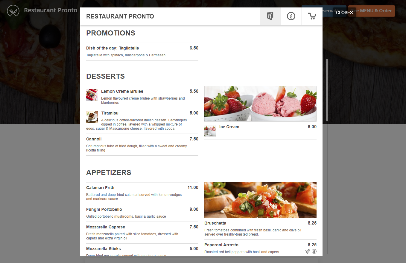
To create the perfect menu for your customers:
- Stick to the classic black writing on a white background for easy reading;
- Use color sparingly, such as red to highlight promotions;
- Rely on professional photography to be the pop of color in your menu. Hungry clients won’t be able to resist mouthwatering images.
Do you want the benefits of a menu that attracts orders without all the effort? Use the GloriaFood menu creator to create an enticing restaurant menu for your website in just a few minutes:
Read more: Restaurant Menu Planning: How to Optimize Your Menu to Sell More
3. Best colors for restaurant interior
The color scheme at your restaurant will depend on your type of cuisine, type of establishment, and the type of atmosphere you want to create for your clients. Here are a couple of examples you can use as inspiration for your business:
- Ivory, beige, white, pale yellow, light gray: ideal for a small traditional sit-down restaurant that wants to make the space feel bigger by using lighter colors;
- Yellow, terracotta, orange, red, gold: these bright saturated colors are ideal for a fast-food restaurant because while they stimulate appetite, they also increase table turnover;
- Yellow, red, grey, black: with a lot of contrast, these colors are fit for a restaurant that wants to make a statement;
- Brown, orange, white, olive: ideal for an Italian restaurant as the colors remind everyone of a vacation in Tuscany;
Final Words
Learning about restaurant color psychology can give you an advantage over your competitors. If you choose inviting colors that stimulate appetite, potential clients will prefer your business over your competition.
You might also like:

