- 1.Keep it simple and easy to navigate
- 2.Make the Order button the most visible thing on your website
- 3.Highlight the table reservation button
- 4.Have the contact information within easy reach
- 5.Rely on pictures to attract customers
- 6.Tempt clients with hard-to-say-no-to promotions
- 7.Include links to social media in your restaurant website design
- 8.Take advantage of your restaurant website design to find new employees
- The website is difficult to navigate (33%)
- Menus were difficult to read (30%)
- Websites looked old or out of date (30%)
If you don’t want to be one of the businesses people avoid because of their website, we are here to help you. In this article, you will find a variety of easy-to-implement ideas for restaurant website design inspiration that will help you attract more customers.
Restaurant website design inspiration & tips:
1.Keep it simple and easy to navigate
Put yourself into your customer’s shoes: what are you searching for when you are opening a restaurant’s website? Chance are you are looking for this information, in the following order: menu, online ordering, table reservation, contact info, pictures and maybe the about us section. Therefore, if you want to create the best online customer experience, you need to create a restaurant website design that seamlessly leads the clients to the important information, with no unnecessary distractions. Here are a few pointers for a simple restaurant website design:
- Create a color palette of maximum three colors for all the elements on your website to avoid distracting clients;
- Don’t add pages for every info you want to add, you risk making your website slow to load;
- Avoid pop-ups as most people are deterred by them.
You can use our restaurant website builder to create a website in minutes that fits all the design criteria we will discuss below. Your restaurant website will have a visible menu button that will convince people to order and all the important information within easy reach.
2. Make the menu button the most visible thing on your website
Why are you looking for restaurant website design inspiration? Is it because you want your website to convert visitors into clients and help you increase your sales? Then you must focus on persuading people to click on the menu & order button. The easiest way to do this is to make the button the most visible thing on the website, so it is the first thing a customer sees when they access your online location. Check out these tips for a menu button that everybody will notice:
- Place it in the top right corner, just above the fold;
- Use a contrasting color to the background;
- Use a font that is slightly bigger than the rest of the text;
- Use a strong CTA (call to action), such as “See Menu & Order”;
- Have the menu button visible on every page.
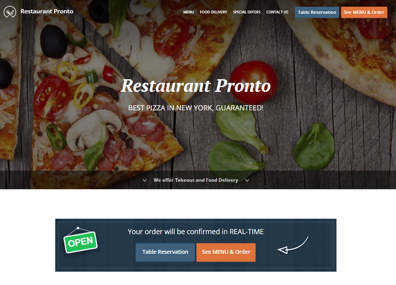 Furthermore, what happens after people click the menu button is as important as the menu button’s appearance. If it is a slow-loading PDF or a simple image with the listed menu items, it won’t help you increase your sales. Instead, that is powered by an online ordering system so people can order your delicious food directly from your website, in just a matter of seconds.

3. Highlight the table reservation button
The next most important thing when you are looking for restaurant website design inspiration, after the menu button, is the table reservation button. If you want to get more people to dine at your restaurant, you must offer them an easy way to book a table online. If they have to search for minutes for a way to reserve a table on your website or if they have to call, they may choose another place to eat at. The best solution for an intuitive and converting restaurant design is to add a table reservation system to your website, like the one included for free in our online ordering system. Check out this demo website to see how easy it is for clients to book a table. 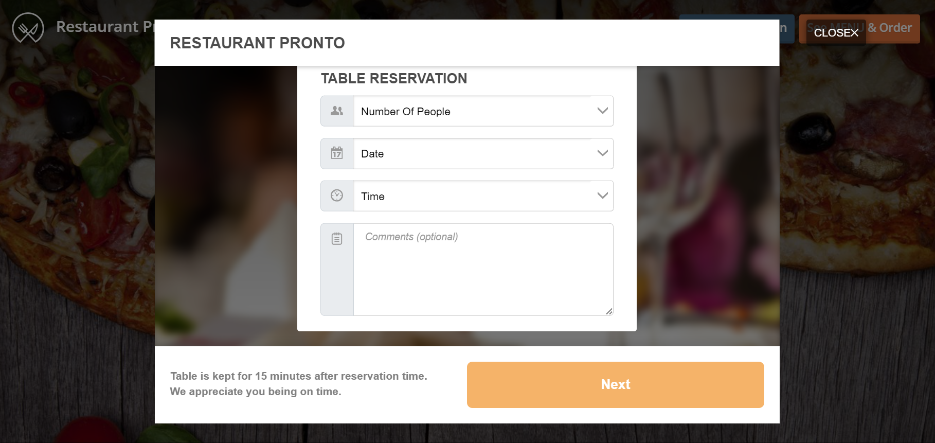
4. Have the contact information within easy reach
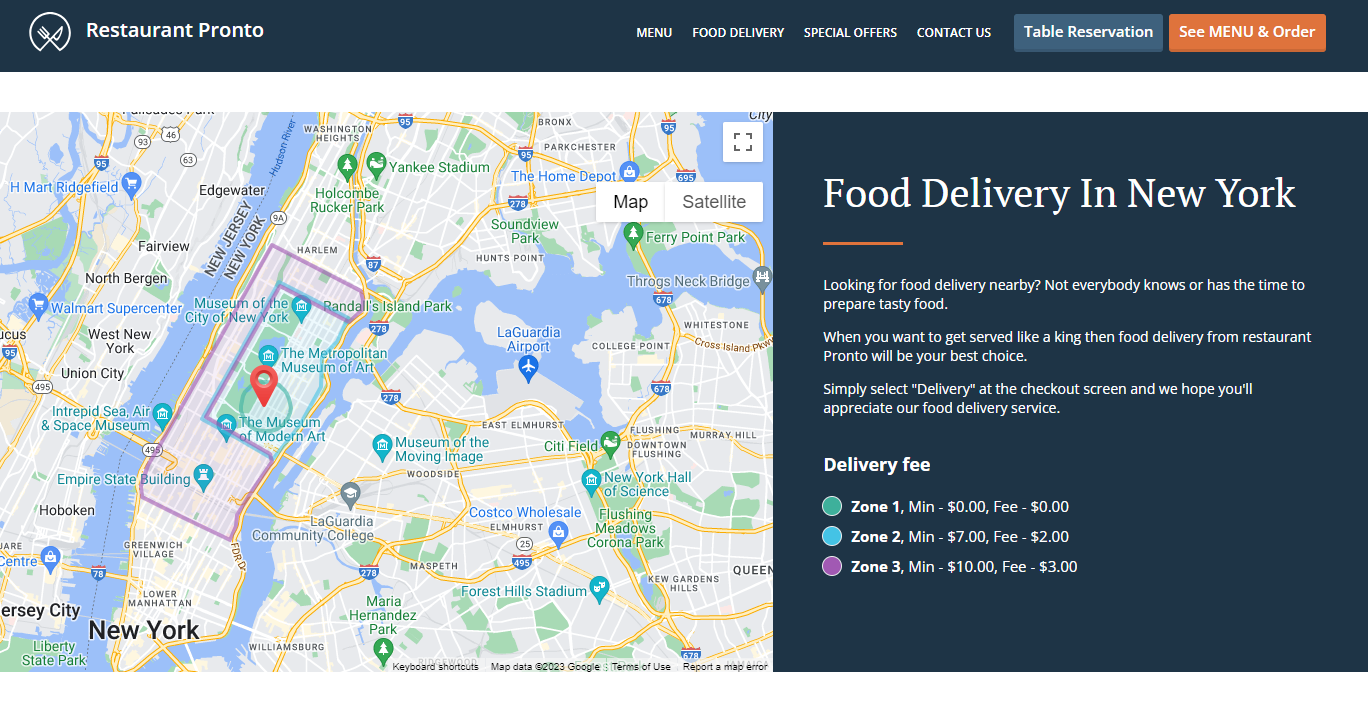
If you want your restaurant to be easy to reach, then you also need to make your contact information easy to find. If you’re looking for restaurant website design inspiration, ensure you have your NAP information (name, address, phone number) in a visible place. Maybe a customer wants to reserve the whole restaurant for an event or another business wants to partner up with your restaurant. Don’t miss out on new opportunities to sell your food by hiding your info at the bottom of your last page. 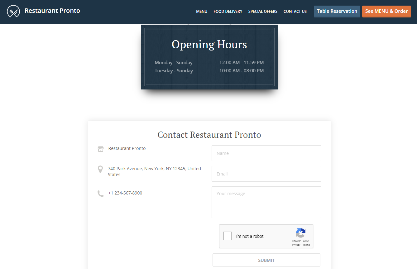 Don’t forget to also have your working hours available on the website. Otherwise, your risk people coming to your restaurant only to find it closed. You lose a client, they lose their trust in you. Moreover, you get bonus points if you also add a map to your location on your restaurant’s website. People will be able to easily find you by identifying landmarks and other businesses around your place.
5.Rely on pictures to attract customers
Nothing convinces a hungry customer to order more than a mouth-watering picture of a dish. Sure, you can have amazing descriptions of your restaurant and cuisine, but, ultimately, the images are going to convince potential clients to take the final step and order. Therefore, when you are looking for restaurant website design inspiration, keep in mind you must have a gallery full of enticing photos of your food. Consider hiring a professional photographer or learning more about restaurant food photography to get impressive images people won’t be able to resist. 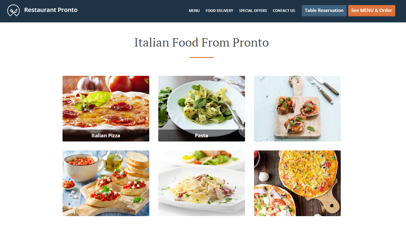
6.Tempt clients with hard-to-say-no-to promotions
Looking for restaurant website design inspiration? We’ve got the perfect example of an item you should include in your restaurant design if you want to increase conversion: promotions. Attractive promotions are a great addition for both your restaurant menu and your restaurant website. Free delivery? 2+ 1 for free? Free item for every $60 spent? You can seamlessly incorporate offers in the design to persuade people to order your food. 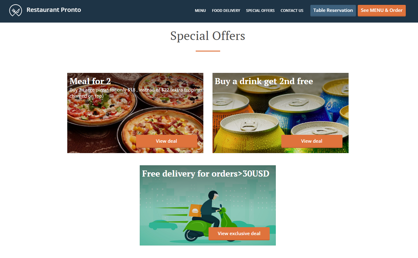 If you use our online ordering system, implementing promotions will only take seconds. You can choose from a variety of tried and tested templates that you can customize to attract different types of customers. Who can resist a great offer?

7. Include links to social media in your restaurant website design
When you are searching for restaurant website design inspiration, you shouldn’t focus only on looks, you must also concentrate on the functionality. A great restaurant website must balance intuitive use, beautiful design, and great functionality. For example, when mapping out a website, you must reserve a space for linking to your social media profiles. This way, you convince clients to also checkout other channels where they can interact with your restaurant and become part of your community. You can also add links to the review platforms you are on, so people can see your restaurant is a great choice by reading positive reviews. 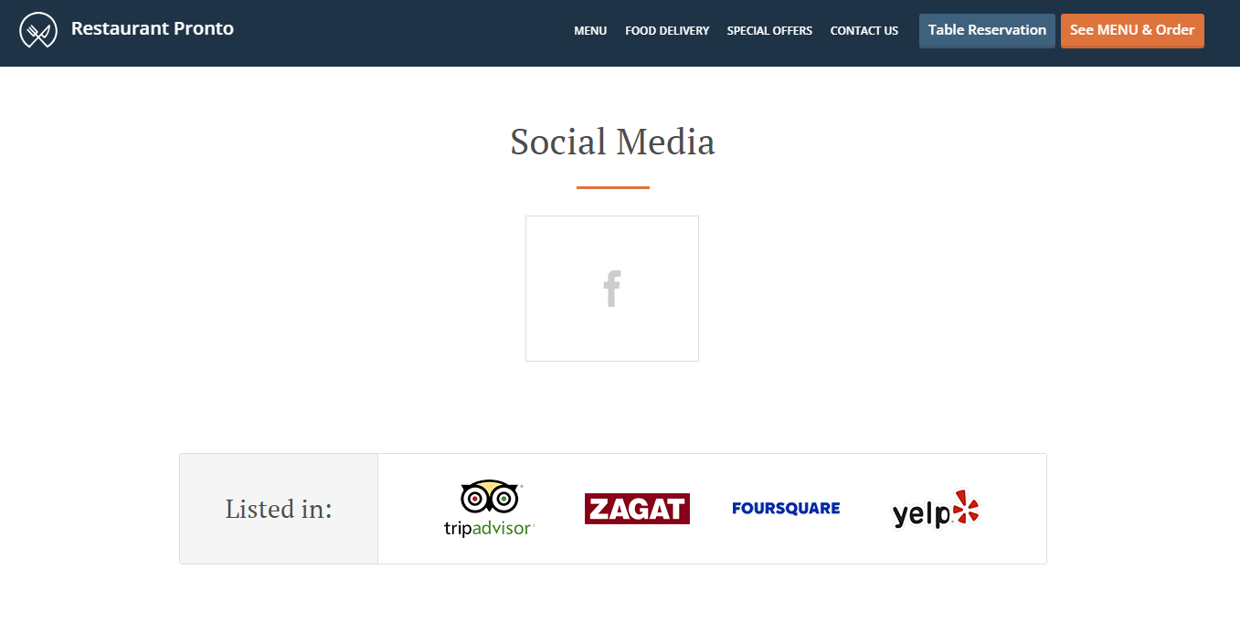
8.Take advantage of your restaurant website design to find new employees
You don’t just create a restaurant website for today, you build it so it can fit your needs for as long as possible. This includes attracting new valuable employees for your business. While the restaurant website’s main goal is to attract new customers, if you add job listings on there, you can also use it to convince productive people to work for you and give potential clients a trust-worthy place to apply for a job. 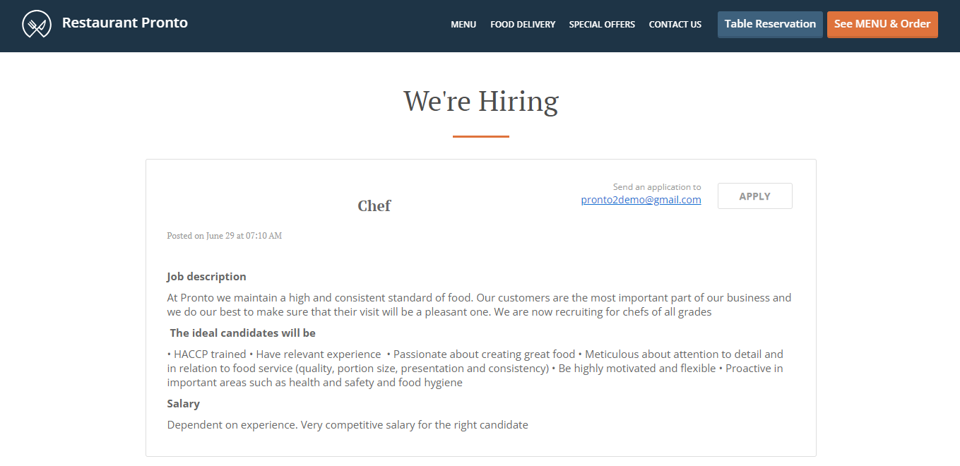
Final Words
If you are looking for restaurant website design inspiration but it seems like too much work to create a design that looks great and convinces people to order, use our restaurant website builder to create a website with a high conversion rate. It will include visible menu and table reservation buttons, attractive promotions, easy to reach information, mouth-watering pictures of your food, links to social media, job listings and much more.
